4 ways to make an application look faster
The responsiveness of a mobile application is a crucial factor for users. If there is fluidity between each action and the loading speed is fast, users will stay more on the application and will not feel any frustration. The waiting time is a major constraint in the digital environment, but it is most felt on mobile or tablet. Apart from the very power of the mobile and the network reception quality, you can always find a way to make the application more responsive and convince the users that it really reacts quickly despite a slow connection or the transfers of too heavy files. Here are some easily applicable procedures to avoid this latency and give an impression of instantaneous experience.
The Instagram method : download while no one is watching
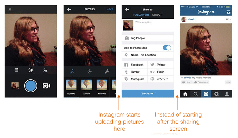
When adding a photo on Instagram, several steps are required before you add the picture to your account and make it visible at all. During these steps, Instagram begins sending the data on its servers while the user is busy adjusting the contrast of the picture or adding a title. From the moment you selected a photo, the application starts transferring the image to reduce (almost) instantly the download of the photo when posting.
Fake content but visible
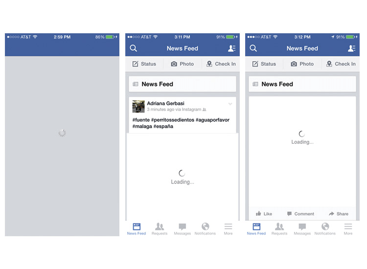
The great problem that will be faced to display the contents faster than (almost) all applications will be the transfer rate of internet data. The users do not like to wait, but when the connection is slow or that the content is too heavy to be loaded quickly, you still have to keep the attention of the users. A blank page with a loading bar (or wheel) is often not enough, you never know when the loading will end and you do not know what to expect. To deal with this problem and increase the user experience, the use of fake content (blocs and grey lines to the photos and the text) provides a visual support while waiting. This does not reduce the loading of the page, but in the head of the user it will be as if.

React instantly
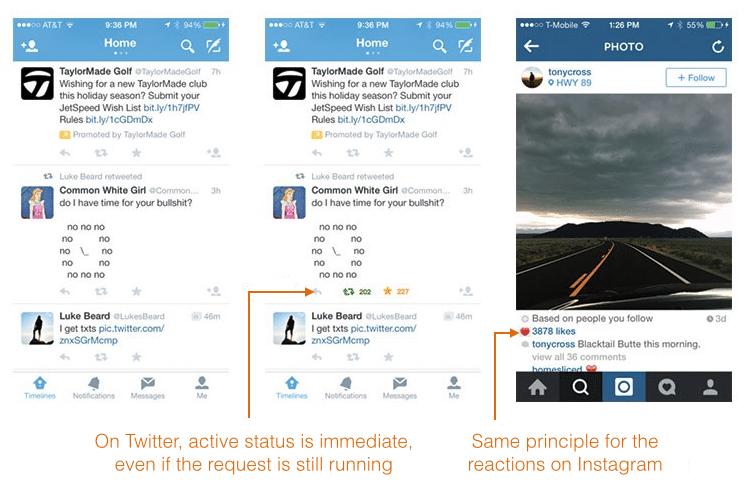
The importance of providing responsiveness to the actions of users is paramount. If the interface change is made immediately after the interaction, this will give importance to the movements made by the users. Run the elements as “active” status even if the request is not yet completely finished, like the principle of “favourites” on Twitter or the “like” on Instagram/Facebook brings the satisfaction of an accomplished task to the user. You can also add dynamism by indicating an ongoing action with a loading bar or a specific movement. The important thing is to make the users understand that their actions took effect and that the screen displays the minimum possible a white/empty screen when loading.

If it’s slow, make it original.
The download is rarely inevitable, even in the best case the users must feel the loading representing the refresh (updating) of the data. By reflex or by need, the users want to refresh and learn the status of their application. If after an action there is no interaction on the part of the application, the frustration and the misunderstanding will be felt and this is what often leads to no longer use it. This is why it is advised to work on an interface that is nice to the eye when loading is in progress.
See a good example here of a good loading animation.

by
Guarana
Filed under App Funding
Tagged
